G Adventures Diaries
OBJECTIVE
The purpose of the project was to design the onboarding process for a new social networking app for an already existing company.
I chose the Toronto based, travel adventure company, G Adventures.
The process included wireframing, A/B and user testing, through to the final high fidelity and prototype.
ROLE
This was an independent project.

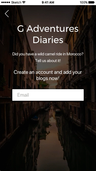
G Adventures Diaries will allow the user to read blogs from current and past customers of G Adventures, regarding their travels with the company. There is also a chat forum section where the users can ask questions about the different packages and read the experiences of past customers and guides.
Once an account is created, the user may post their own blogs to the site and start their own chat forums.
The tone of G Adventures Diaries was taken from the parent company's website. The same colour scheme, fonts and voice were used throughout the mockups.
WIREFRAMES & TESTING
After I created the first draft of wireframes, I conducted some user testing on the splash pages and the sign-in/sign-up pages and found the following:
- Users were confused by the large icons.
- It wasn't clearly understood that the compass icon was clickable.
- Icons were too big and distracting.
- The sign-in page's Facebook and Google icons were too small. Users preferred full size buttons.
The wireframes included informative animations and popups that help the user understand how they can start new blogs or new chat forums. They are also informed that they must create an account first.
ON-BOARDING USER FLOW
The on-boarding user flow is designed so that the user can exit any section of the process at anytime.
Also, sign-up is not required until the user wants to post a blog or start a chat forum, so that they can freely explore the posted blogs and read the chats.
HIGH FIDELITY TESTING

(A) was the preferred colour , although (B) was used for the app.

(A) was the preferred shade.
An A/B test was conducted through Typeform to find the preferred button colour for the splash pages. The results came out with purple as the top choice, however, I went against the testing as the green was the brand's button colour and it had a better contrast ratio with the black background.
The following test was to deturmine the more appealing shade of green. The thought was that, although the original green stayed on brand with the parent website, the app would benefit by using a more appealing shade.
The first shade of green (A), won, and was used in the app.
ITERATIONS

During the high fidelity stage, I went through many iterations, altering the colours, the images and overlays, the form style, buttons and the account page. Each step taught me more about the process, how important user feedback is and the value of learning from pre-existing apps.